Home > All Projects >
Project Case
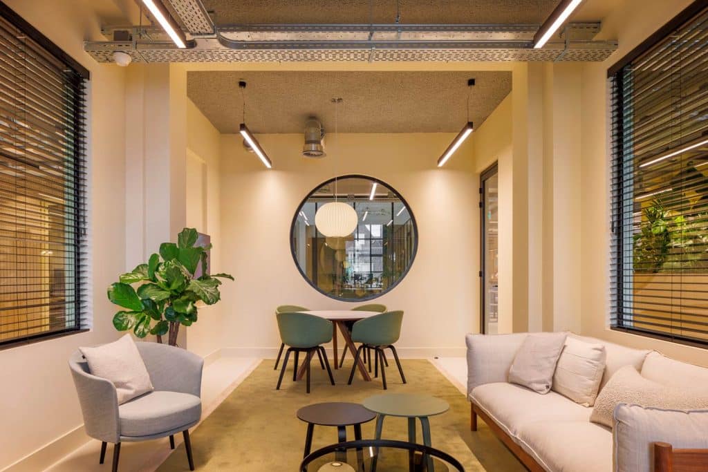
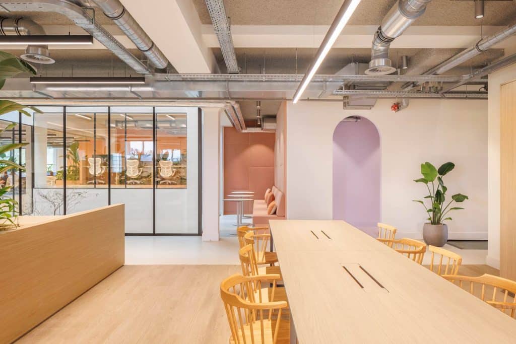
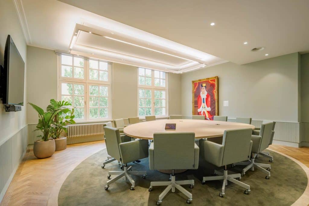
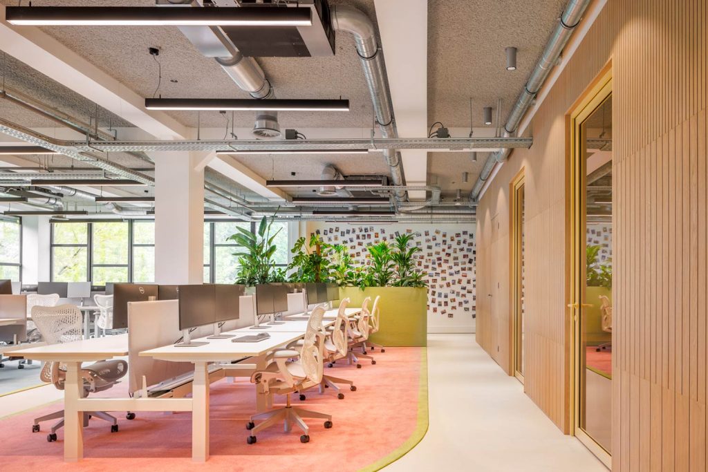
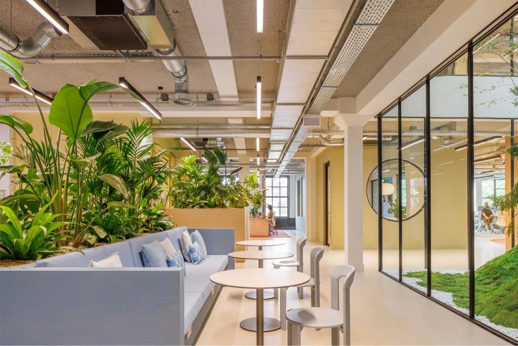
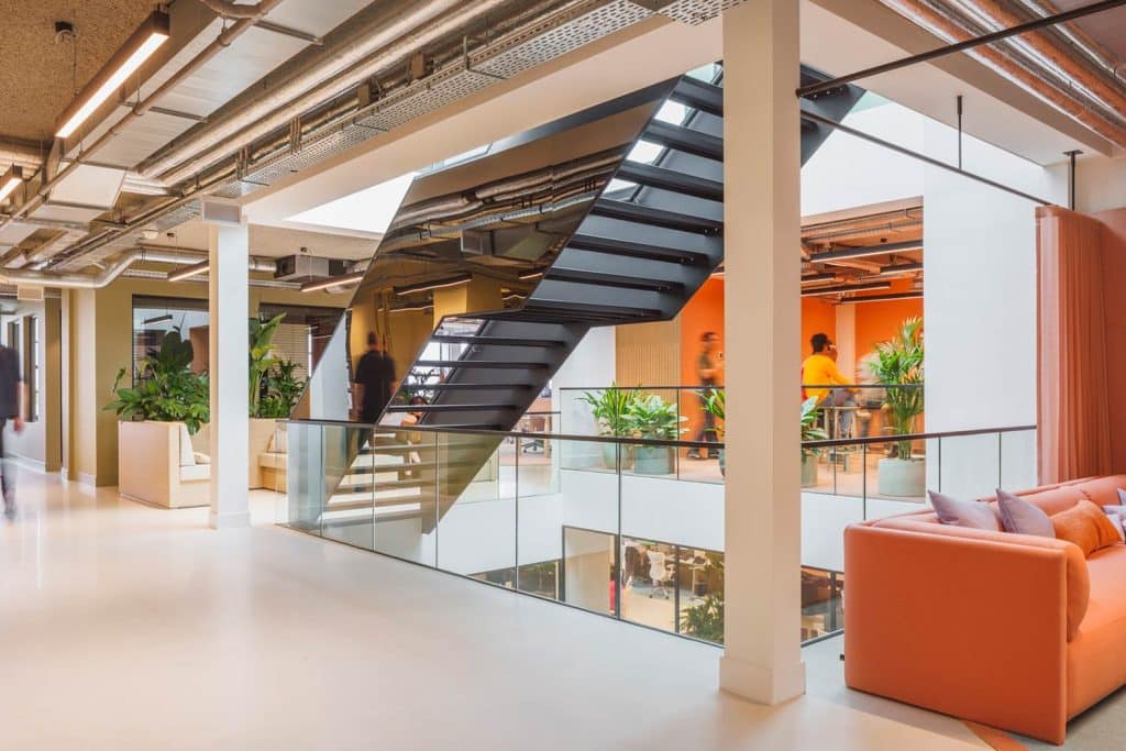
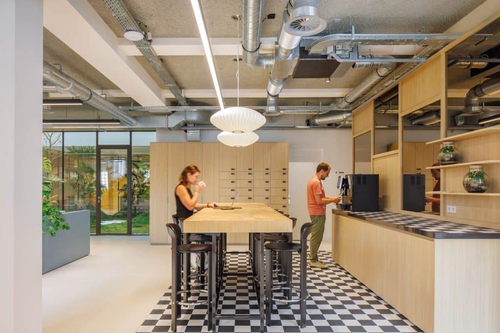
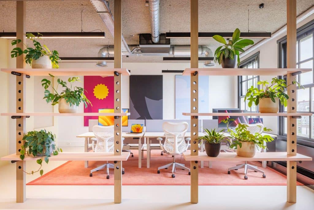
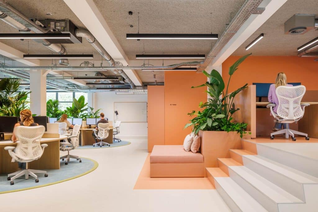
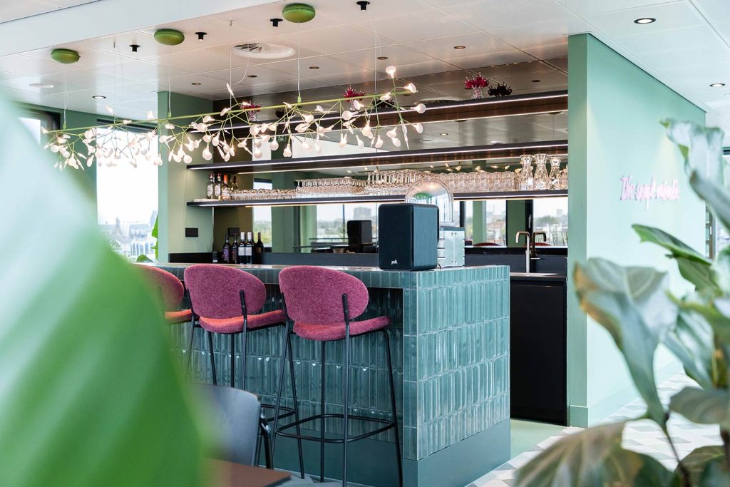
The building manager, CBRE, stripped the office down to its shell and upgraded all installations, a crucial step towards sustainability. At the same time, these installations were tailored to the new layout plan. This approach resulted in a close and integrated collaboration between Ditt and CBRE during the project. Previously, dé Vakantiediscounter was based at this location, and now that they have returned, they are making extensive use of floors 3, 4, 5, and 6. The designers at Ditt were tasked with a challenging yet enjoyable project, leading to a unique design concept characterized by light pastel colors, natural wood tones, and abundant greenery. Special attention was given to custom-made elements, detailed upholstery, and distinctive branding and artwork featuring ‘Mario,’ the mascot of dé Vakantiediscounter. The upgraded installations and sustainable material usage make the project future-proof for the long term, perfectly aligning with the client’s growth expectations.
Office Guide
As an added service, Ditt created a workplace guide for dé VakantieDiscounter. This “Office Guide” includes all the information about the new office, including floor plans for each level, guidelines for using the office and workspaces, and the locations of the meeting rooms. Thanks to this guide, new employees can familiarize themselves with the office and quickly feel at home.
Art in Offices
The artwork in this office is a blend of Old Masters and pieces featuring Mario, the mascot of dé VakantieDiscounter. In the building…
